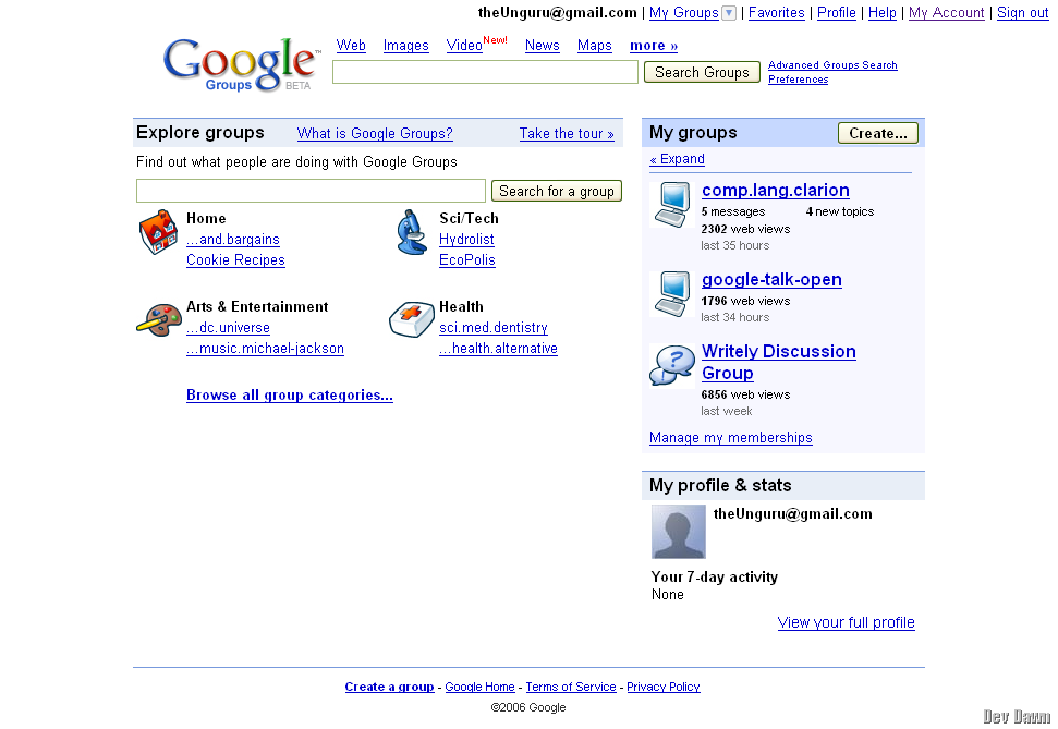
The new Google Groups is out.
And I say this without hyperbole, this is a million times better.
That is, what I really mean to say, is that Our bases truly belong to Google. They are bringing everything together, piece by piece. And it looks good.

There’s a number of cool changes. Initially they might seem just cosmetic, and they are, but I believe driven from a greater purpose than "to just make it looks good".
![googles_groupings_002[17] googles_groupings_002[17]](http://stuandrews.com/wp-content/uploads/2011/02/googles_groupings_00217.png)
There are 6 major components to the window.
- Let’s call this the User bar. It contains the most important feature of any Google app. You. YOU. ME. The User. There is probably a barnyard full of Google Professors working away at just this feature. Well. Maybe not a full barnyard. But the design choices as to our own individuality within the Google application frameworks are (I believe) something vital, and Google seems to be treating it as such
- The Google Main Page bar. We all know this. It’s gone through minimal changes since it’s incarnation.
- The Body bar (this "bar" naming convention might just be a little crazy).
- Your own Groups. Unless you are going a-searching, this’ll be where you click most of the time.
- The Profile bar. A newbie bar, any GMailers will be familiar with this. It’s basically a nice little widget version of the User bar up top. With less clicks, but with a Picture! Plus, there’s an activity list, which i assume (cause i have no activity) lists what you’ve done in any of the Groups in the past time period.
- Bottom bar. I included this, because it’s got the "Create a group" link, which steps it up a notch from the normal this is where we link our normal boring stuff like terms etc functionality.
Now. Let’s rifle through some more shots.
![googles_groupings_003[8] googles_groupings_003[8]](http://stuandrews.com/wp-content/uploads/2011/02/googles_groupings_0038.png)
This is a nice little drop down menu. Basically gives you the same stuff as is on the front page, but in the menu. Which stays around regardless of where you travel amongst the groups.
![googles_groupings_004[8] googles_groupings_004[8]](http://stuandrews.com/wp-content/uploads/2011/02/googles_groupings_0048.png)
Here’s a Group. Notice the nice gray coloring, and the other art direction. The big letters up top for the breadcrumb trail is cool. Big is okay, depending on where and how much it’s used.
![googles_groupings_005[8] googles_groupings_005[8]](http://stuandrews.com/wp-content/uploads/2011/02/googles_groupings_0058.png)
This is just highlighting what I thought were areas of interest. The Group info particularly is cool. You get to see the number of Subscribers, the Activity level, and other stuff. One more thing, the Star has made it’s way across from GMail to here.
![googles_groupings_006[9] googles_groupings_006[9]](http://stuandrews.com/wp-content/uploads/2011/02/googles_groupings_0069.png)
This is a conversation within a group. They’ve astheticised (nice word, if it is a word) the look. Clean. Lean. Simple. Which is all for the better.
I had a few more screenies, but they aren’t fitting properly, so I’ll just cut to the chase.
Following are two sets of two screenies showing some similarities between Google Groups and GMail. These are obvious, and I’m not saying "Oh wow, Google actually thought of making there stuff look that same", because of course they did. It’s just cool.
The "User bar"
![googles_groupings_011[9] googles_groupings_011[9]](http://stuandrews.com/wp-content/uploads/2011/02/googles_groupings_0119.png)
![googles_groupings_012[8] googles_groupings_012[8]](http://stuandrews.com/wp-content/uploads/2011/02/googles_groupings_0128.png)
And, the Star!
![googles_groupings_013[8] googles_groupings_013[8]](http://stuandrews.com/wp-content/uploads/2011/02/googles_groupings_0138.png)
![googles_groupings_014[8] googles_groupings_014[8]](http://stuandrews.com/wp-content/uploads/2011/02/googles_groupings_0148.png)
Okay. So it’s a pretty lame brief look.
Still, it’s a post. And a post is a post. Is a post. Is ..
Man, those Watermarks can be a bit annoying to look at.
