Fun with Formatting

Since last Thursday, I’ve had a wonderful chaotic experience.

My first format and reinstall on this laptop.

She now purrs along a fair bit faster than before that terrible day when certain registry errors started appearing.

So for two days I copied the contents of the harddrive and then reinstalled windows (twice, because the first time I didn’t use my dell cd).

Have spent the last couple of days (and still am) getting back to my dev environment. It’s amazing just what I had grown used to. I’m going to blog the tools one day. A list of them.

A good little nugget to come out of them was that I knocked up a password keeper system. Very simple. A browse of the records. Each record has a Type Detail and the Password.

Edit :: Just realised .. not enough info for the Website Type. You’d need to know username as well. This is mostly for logging into cms backend.

It’s easy. Quick. I’m sick of losing all the passwords I have around the place. Now they are centralised.

Nothing much more at the moment. Still got a mountain of stuff to get through. Work. Work. More work.

Cheers,

Drop-Down Listbox vs Select Window

The first System I wrote on my own is still alive and moving forward.

The problem I face (which most of you would have), is that my own methodologies have matured far beyond where they were 4 years ago. Actually, even 1 year ago, but that’s beside the point.

When I wrote the bulk of this System, I didn’t know about the Select Button/Window paradigm for getting a field value. I only knew about the DropDown Listbox/Combo.

Both have an argument for use.

The Combo gets to be right there, on the same window. This is a powerful thing, too often underestimated. The User (in my experience) likes that the information is at their fingertips.

The problem is (in Clarion) that large record numbers make this a daunting task for much of the data we look at. Of course, that’s why I wrote an Autocomplete template (Requires Subscription) to make sure a set number of records were put into the buffer at one time (and fixing a couple of other things too).

The Select paradigm is cool. I like it, because it flows in my brain a lot better (this is most often not actually what makes sense to the User, even though sometimes the functionality is better). You type the value into the entry .. if it doesn’t exist (on tabbing off, or pressing the select button) a Select window is brought up. The way I’ve learned it, you can then have further Insert/Change/Delete functionality on the Select window, giving he User full access to that particular (and others) file. Back on the entry, when opening up an existing file, it’s easy to change the value either by typing, or lazily (better sometimes) by mouse-clicking on the Select button and then finding the value in the listbox.

Of course, the same problem that plagues the Combo is the problem here. Large record numbers make it harder to navigate. Of course, there are ways to push through this. Just requires some clean and clever thinking about the interface, searching, and selection functionality.

Phew. What started out to be just an Aside post has turned into something a little longer.

The question I have this morning is this .. which do you prefer? Drop-Down Combo/Listbox or Select Button/Window? Is it situational, or do you consistently use one or the other?

Cheers,

I Like Walks On The Beach With Dolphins And Sharks

Addendum Thoughts on GTalk Upgrade (File-Sharing mostly)

I’m scared.

It’s not that Google is the first to gather information on people. I mean, check out the Bible. It’s got plenty of info on the human race. Personal stuff. Imagine being remembered for being so fat that your belly sucked in an entire sword. And that book is plenty old.

But our public conscience, globally, is waking up to just what kind of power the gathering of such personal information means. Google have access to our search thoughts. Which, from what we summise, are pretty good at determining our personal habits etc etc.

What then with the File-Sharing functionality.

It’s another layer of information gathering. They are providing, free of charge, a massive file sharing peer to peer network. From what I’ve read, the hardware behind the scenes is top notch. It’s Google afterall. They do things well.

But being able to share files means people will be dragging and dropping away little bits of who we are. What kind of music we listen to. What pictures we like looking at. Our writing style.

Already they have access to our work conversations. Most of us don’t turn off the ability for gtalk to save a record of the conversation in gmail. This is a great tool for us, the User. But it’s also a record. A record held by someone other than my filing cabinet in the dusty back room of the office.

Now don’t get me wrong. I’m not a panic merchant conspiracy theorist. But the mind easily follows these thoughts. It’s very possible that one day a gold-finger type guy is going to buy out Google and start laughing very high and loud. But then again, that probably won’t happen. Apes would rule the world first. Hmmmm.

Anyway, that’s my two cents prompted by use of the file-sharing in the latest GTalk upgrade.

Talking It G-Style

GTalk (Google Talk) has had an upgrade.

What do you get?

Well, depends how into the whole im thing.

1. File Sharing .. you get to transfer files to your peeps. Not bad at all, depending on your use of GTalk. In my bizo i can’t see much of a use, but you never know.

gtalkupgrade_001

2. Voice Mail .. now this is interesting. I like the idea a lot, in a gimicky kind of way. It’s got potential for some funny stunts, but I can’t see it increasing our productivity in development :) heh heh.

gtalkupgrade_002

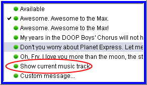
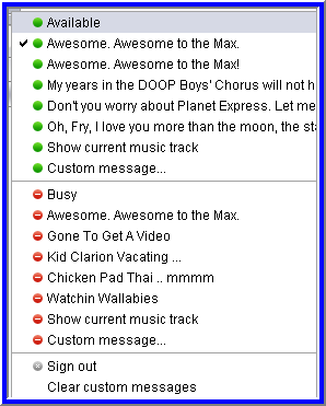
3. Music Trends .. Hmmm. Just a specific tie into the sig line. You can get it to make your sig into the song your currently listening too. Not bad.

gtalkupgrade_003

Under the hood there have been some subtle improvements.

  • When talking with someone, in the base window, a voice bubble icon appears, instead of the (red, green, orange) circlegtalkupgrade_004
  • Enhancements to the Sig line interface, not sure, but looks like a visual tightening of the interfacegtalkupgrade_005
  • when hovering over contacts in the base window, the window that pops up allows you access to functionality like sending files (not sure if this is brand new, might have been around for a while, but i just really looked at itgtalkupgrade_006

So Google has kicked it up another notch, bam. Seriously, they are doing good with this ..

My only concern is that gtalk will become overly crowded (interface-wise) like all the other im clients. Never let it be so!

Cheers,

Meandering Down The River / Paddle Upstream

The dedication to our work sometimes requires more than just excitement. I’ve talked about this before. Most of the time it’s going to be slogging it out, rather than flying on the high.

This is particularly true when you are gaining no (perceived, and usually monetary, or fame) return on your investment for the bulk of the initial work.

This is particularly true for people like me at this time. Jack of too much, Master to noone. Or something like that :).

This is particularly true when you haven’t got the entrepreneurial fire. To create something out of nothing.

Right now, I’m feeling (feelings aren’t very good when trying to run a business, but they are there nonetheless, and a good tool to use rightly) sick of getting too creative, starting too many cool ideas, having those ideas in the first place, working my jack-a-trade body to the fat-covered bone.

I’m not saying this is watershed-stu or anything. Just that those opportunities aren’t going to wait for a more opportune time. I can’t sit wondering, waiting, then moaning because once again I’ve got a single client for a piece of software i’ve put hundreds of hours into. Or even software that’s still in beta (eeek, Projman hasn’t had an update for a couple of weeks, what’s doing????).

Thanks for tuning in to listen to my brain-straining moments of emotional turmoil.

Cheers till next we meet,

Examining The Doctor

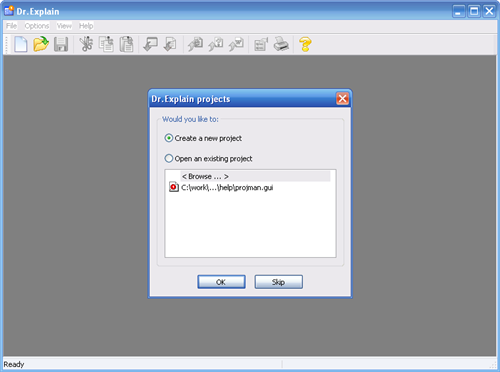
Dr. Explain is, without question, an awesome piece of software.
drexplain_review_001

Let me explain. No, there is too much. Let me sum up.

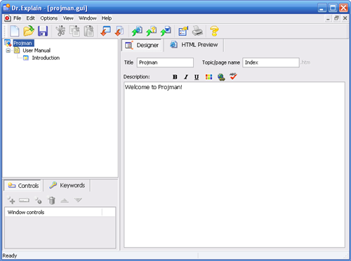
The guys behind Dr. Explain have created a simple and powerful problem solver. The problem, of course, is how to quickly create Help Documentation. Their solution is the best I’ve seen.
drexplain_review_002

For what it does.

Dr. Explain doesn’t have a whole bunch of large pieces of functionality. It is a streamlined app. The buttons are placed well, shortcut keys appropriately set. The interface is clean and easy to use.

drexplain_review_005

Basically, you need to come at Dr. Explain with a planned document structure. If you have the words/structure in your mind, you’ll be firing up Help Documentation in no time at all.

And I mean no time. I started using Dr. Explain with only a brief thunk about what I wanted .. mostly it was just to experiment, and I was able to put together stuff very quickly.
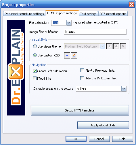
drexplain_review_008

So there is a minimal feature set, but that feature set is very rich.

The layout of the pages created is quite well structured. You can alter what appears on the pages by tampering with the CSS Interface (Dr. Explain’s Interface into the CSS), or get stuck into the CSS itself (limited text editor).
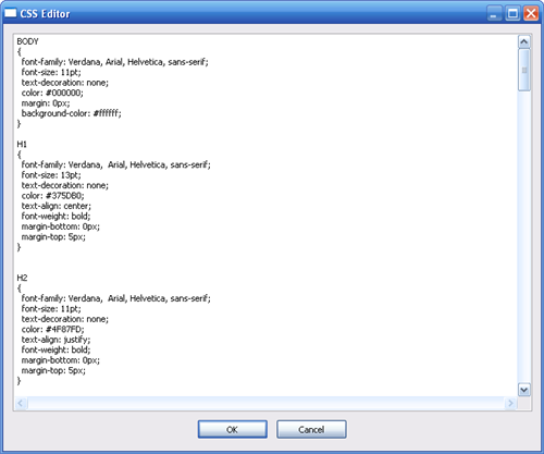
drexplain_review_010

I haven’t mentioned probably the biggest selling point of Dr. Explain yet.
drexplain_review_004

It’s got something like SnagIt, only far more focussed (see below capture).
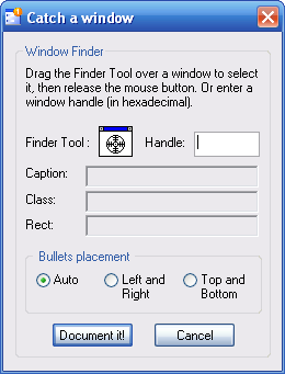
drexplain_review_003

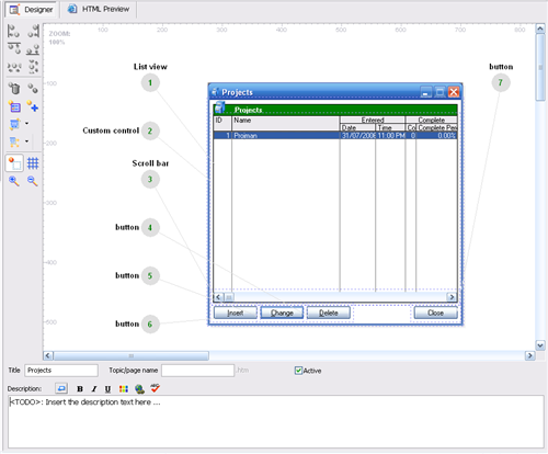
You drag the anchor onto the page you want, and it goes to work. Dr. Explain creates a "Chart", which is the window captured, along with a bunch of bullets attached to each of the controls on said window. It’s pretty cool stuff. Obviously, sometimes you don’t want all the controls, but that’s not really an issue. Just get rid of them.
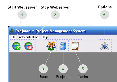
drexplain_review_012

The end result of this is a page which has the window at the top, the bullets linking to their own Descriptions further down the page. It’s a perfect way to bring the functionality of the system to life within Help Documentation. The user can click on the button to get to the Help for it.
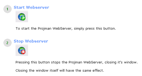
drexplain_review_013

You have a huge set of options, Global Options, Project Options, Chart (the window) Options.
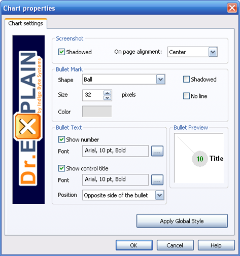
drexplain_review_006

You can mess with the HTML templates of the pages created.
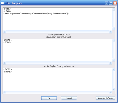
drexplain_review_009

You can set Global Options and then pull them down into individual Chart pages.
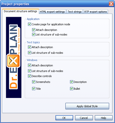
drexplain_review_007

Dr. Explain lets you export to either HTML, CHM, or RTF file formats (yeah, I know, HTML isn’t really a file format).

It’s awesome. Awesome to the Max.

Dr. Explain, as a tool, is second-to-none in what it does.

Here’s my summary of my Sum Up Review of Dr. Explain,\r\n

  • Extremely easy to get from thoughts to actual Help Documentation
  • Awesome to the Max Window Capture functionality
  • Clean, simple layout
  • Massive amount of Options, ability to change almost anything

What struck me as missing (these things might actually be in Dr. Explain somewhere, but I haven’t found them yet),\r\n

  • Add Images to Topic Pages
  • Add custom text in any place on the "Window" page, the one with the window capture
  • Option to edit anything about the CSS, even if it’s screwing with the functionality
      I understand this isn’t actually good for the software, and is bad design (my idea). It’s a good thing that you can’t screw with the CSS Templates, but it was just something that passed across my mind while fiddling. The reality is, you can just open up the CSS file yourself and get to work. So basically, this isn’t really a problem
  • (This is very picky) More options for the bullets (shapes, lines, colors, ..)

In the end, for the small amount of mulah the makers are asking for, Dr. Explain is an awesome (there’s that word again) tool to have in your arsenal. There’s nothing else that gets you directed (by that I mean the window with the controls all bulleted, descriptions easily entered) documentation as quick, lean and simple as this baby does.

So go get it, try it out. You’ll see what I mean.

Et’Tube Brutus? Or Ajax ..

Read a couple of interesting articles this morning.

John C. Dvorak has a new article, Missing the point about YouTube. It’s quite a good read. I found myself wondering at just how there’s another story of unprecendented growth (Google, Ajax) in our world of techo-stuff. Despite the worries about "monetizing" YouTube, I’d like to be it’s creators.

Then there’s a look at What’s So Special About AJAX?. It’s got a bunch of different guys sounding off about our favourite (but getting slightly overused) functionality grouping.

There’s some good info there. Lots of opinion, but it’s good to take a look at what other’s are thinking.

Here’s a snippet,

5 – Ajax is allowing people to get paid to code in JavaScript. Would you ever have guessed that?